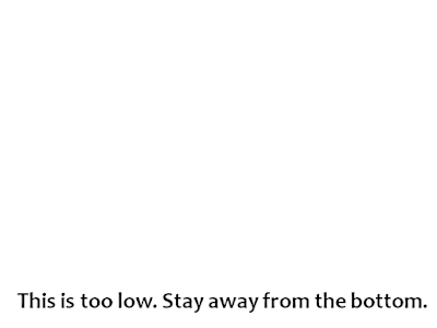
Have no text at the bottom of the slide
Yesterday I conducted a presentations workshop in Pune. It was a workshop on basics of presentations to under graduate students from all over India and was held as part of Sympulse, the annual management fest at Symbiosis Center for Management Studies UG. The workshop was successful and I too enjoyed a lot.
While I will write about the workshop and what I taught there in future posts. This post is about a simple feedback I received from two students. A lot of my slides had text at the bottom and this was getting difficult to read for students at the back (especially if a slightly taller person was sitting on their front). Here is a sample:
The lesson for all my future presentations is simple: Have no text at the bottom of the slide.
Original Page: http://feedproxy.google.com/~r/AllAboutPresentations/~3/WLREVGJiSfI/have-no-text-at-bottom-of-slide.html
Inviato da iPad

Nessun commento:
Posta un commento